|
This week I have been texturing fabric so I can create "art references" for Tom (the artist of my book) to draw. It's also a great way to remind myself how to do the techniques so I can write the instructions more clearly. Here I am pleating some hand-dyed fabric using a purchased pleater. First press the fabric to remove all the wrinkles. Starting at the bottom edge, push the fabric into each pleat with your fingers as in the photo below. If you want to make larger pleats you can skip a few spaces, but I like the look of narrow pleats. 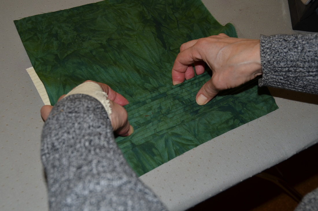
It's a good idea to press the pleats every couple of rows as you work, just to keep them in place. 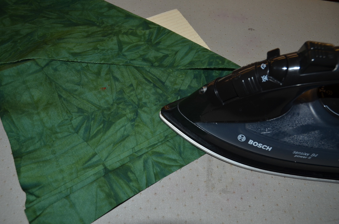
Once I had made enough pleats, I applied some discharge paste to the fabric with a sponge to see what would happen. 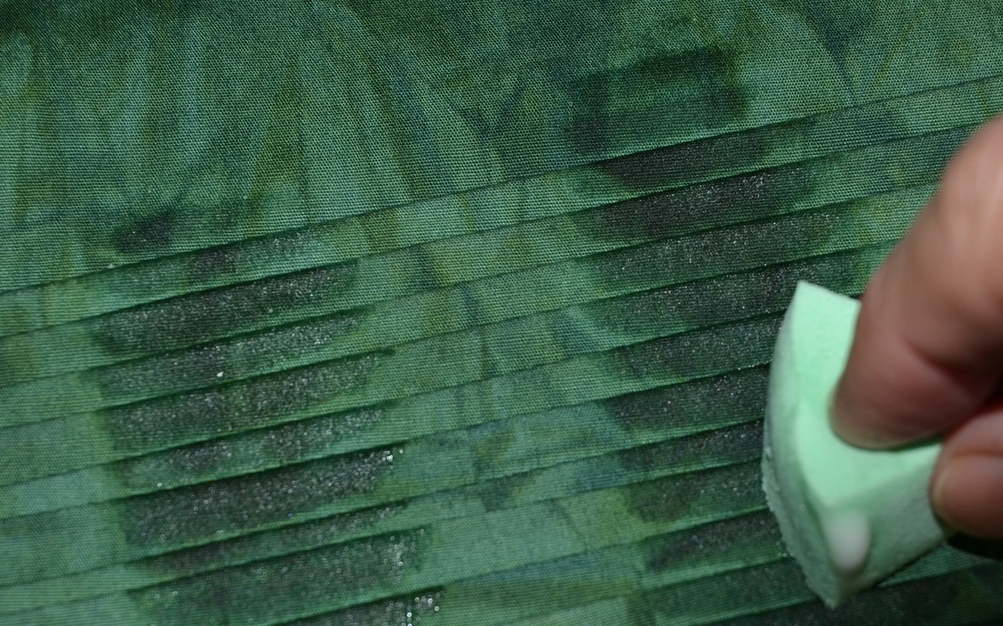
I drew some lines in the discharge paste with Markal paintstiks. I then applied metallic copper textile paint to the pleats using a brush (the X). I dipped my favourite Colouricious stamps in the paint and made a couple of stamps (snails on the right). 
When the paint and discharge paste were dry, I steam-pressed the fabric to discharge the colour. Then I removed the pleated fabric carefully from the pleater. You can see the grayish-white areas on the right where the fabric has discharged. 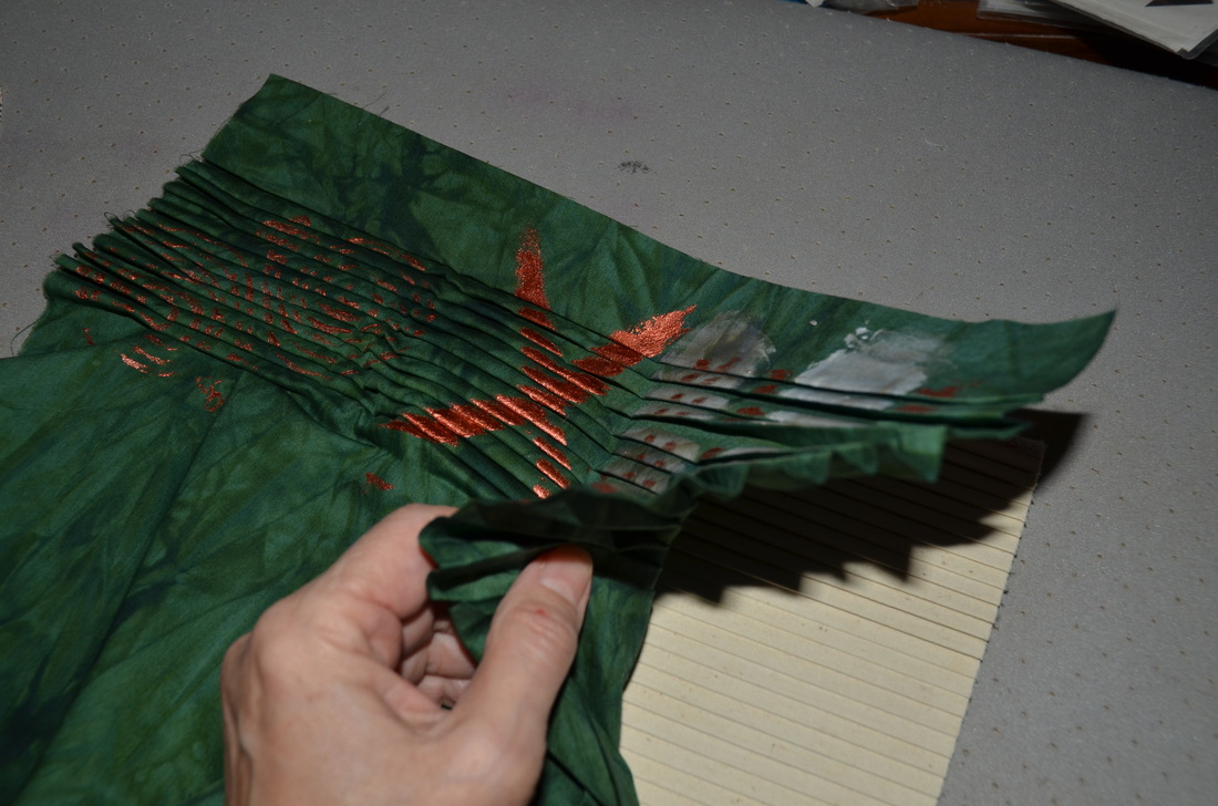
Here is the fabric unpleated and pressed. A bit dull, but quite fun the way the design has broken up. So, to liven things up, I decided to re-pleat the fabric but in the opposite direction. 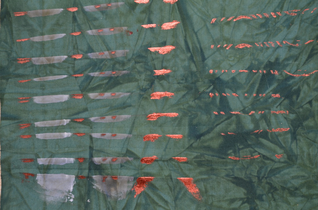
I used a foam roller to apply a layer of yellow DeColourant Plus to the fabric (this is a discharge paste with a textile colour added to it, so that when the fabric is discharged, the white area is replaced with that colour). 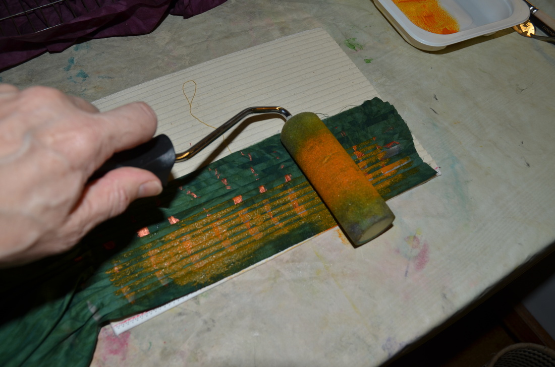
I also daubed on some dots with pale green textile paint and a brush. 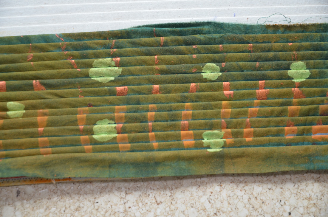
Here is the finished result, unpleated and pressed, making a very irregular plaid design. Not exactly a failed experiment, but it will look better when it's cut up for patchwork, I think! 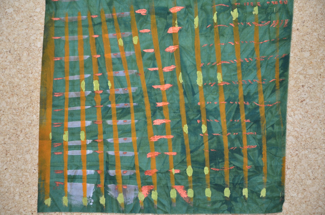
Next time, puff texturing!
4 Comments
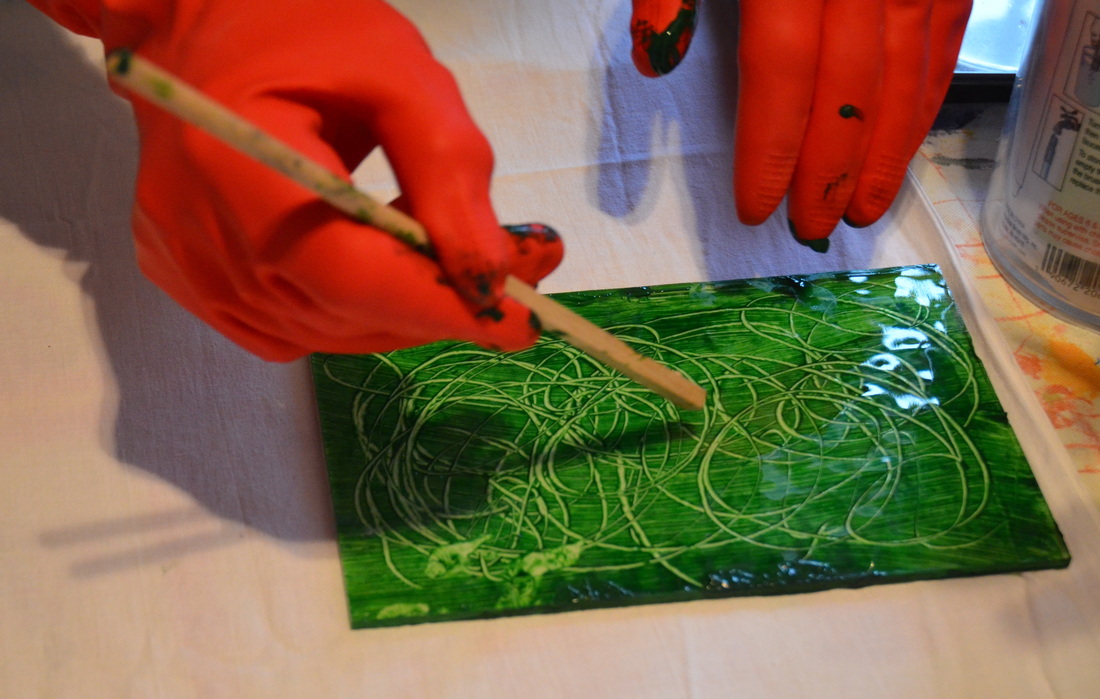 Stamping a monoprint is easy. I added textile paint to the glass printing plate shown here and brayered it smoothly. I then drew some lines in the paint with the end of a paintbrush - just some easy squiggles. 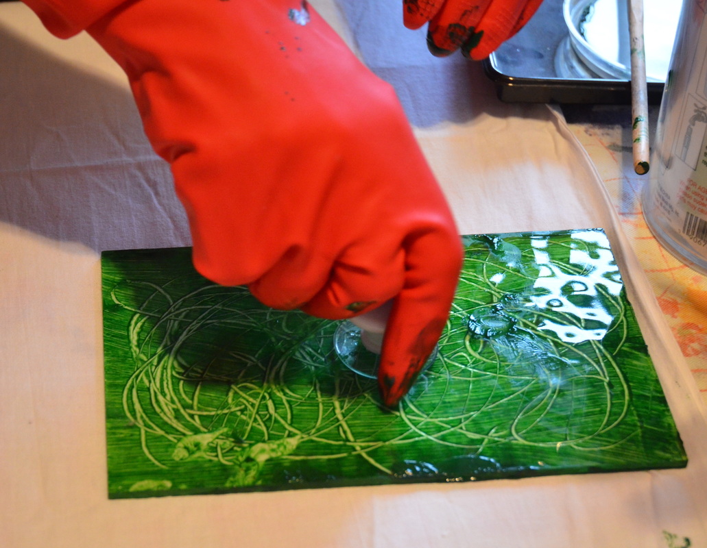 I carefully lifted up the printing plate and placed it face down on the fabric. I attached a little handle that has a suction cup on it for ease in lifting it later, and pressed the plate onto the fabric. 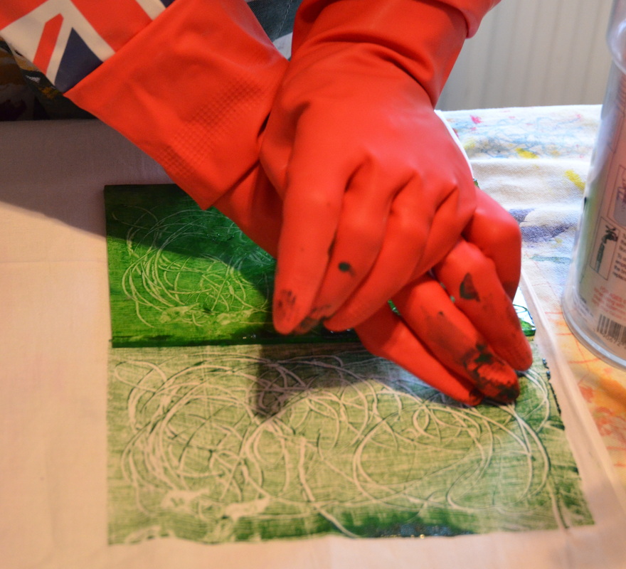 You can see the first monoprint here, especially my mistake! I left blobs of paint on the edge of the plate which has caused that dark splodge in the foreground. Well, that splodge can either be cut away, overprinted or painted with another colour to make it seem as if it was always meant to be there. You can't fail when doing surface design, keep that in mind! I picked up the printing plate by the handle and pressed it down again next to the first one, pressing very firmly to get all the textile paint onto the fabric. This second monoprint is called a ghost print because it is always much lighter than the first. 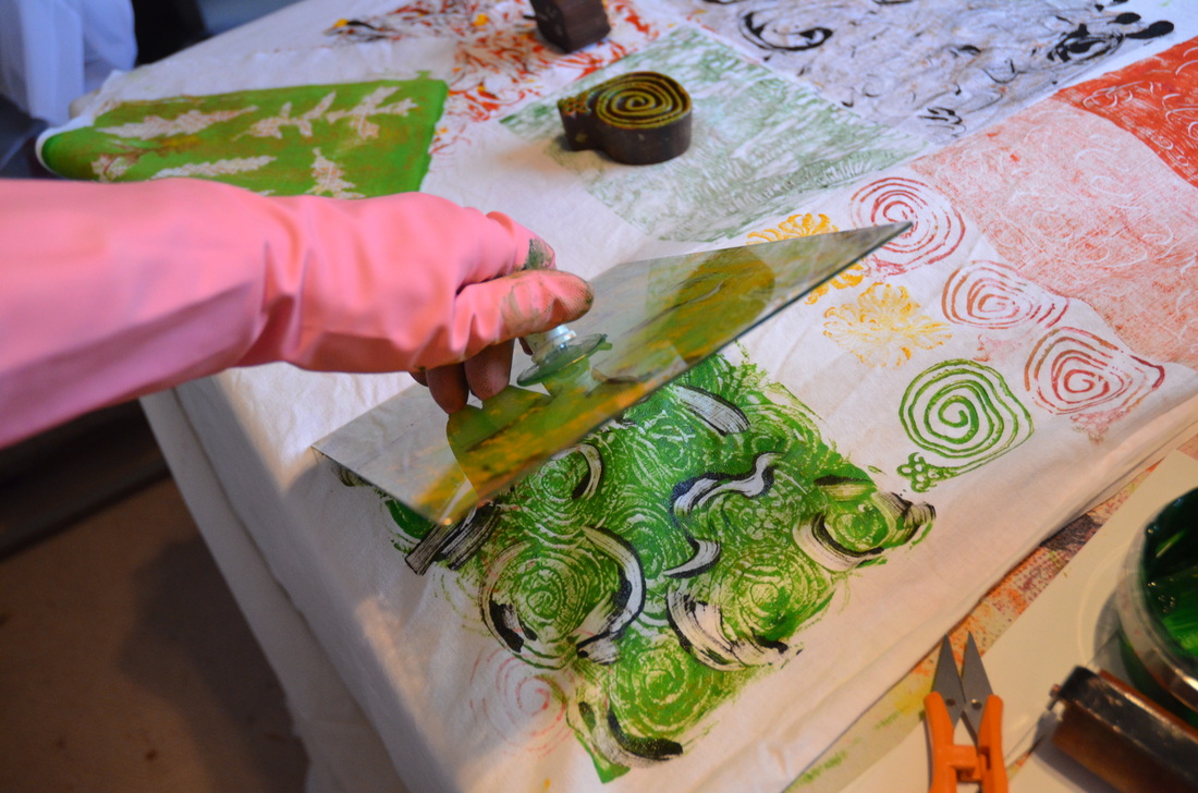 This photo shows lifting up the stamp after making a different monoprint. As you can see in the background, this was a day of experimentation and we were rapidly running out of room! That little wooden stamp you can see in the background made those gorgeous little snails to the right of the monoprint. I got the stamp from Colouricious who have an amazing selection: www.colouricious.com/ 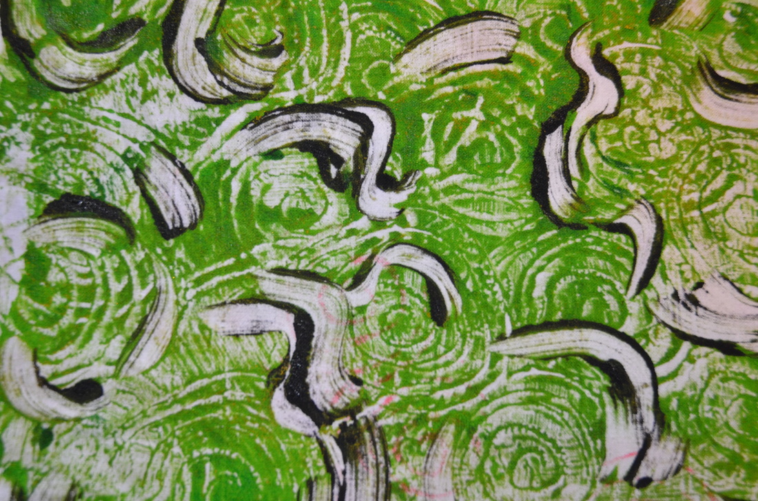 Here's a shot of the finished piece. I had stamped it over some pink "ghost print" snails which you can just make out in the middle. 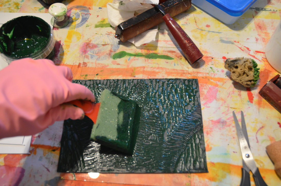 The final stamps of the day were made using a linocut that my son had done in school. I coated the surface with textile paint, being careful not to get too much in the grooves. 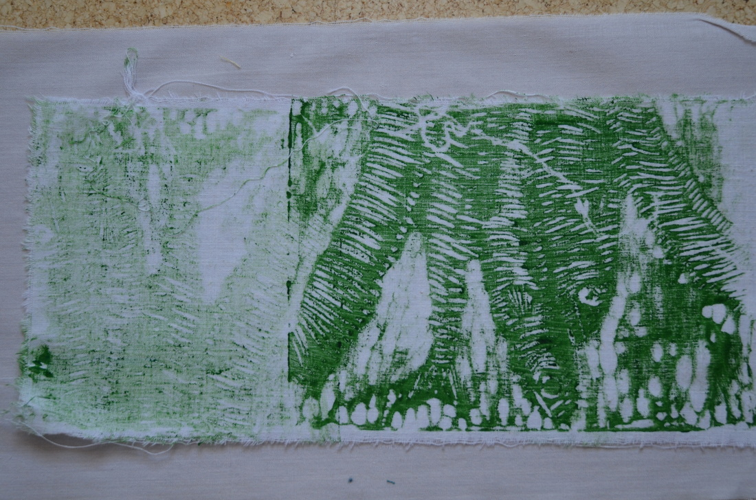 On the right you can see the first stamp which isn't great as there was too much paint on the surface of the lino. On the left is a partial ghost stamp which was done in reverse. 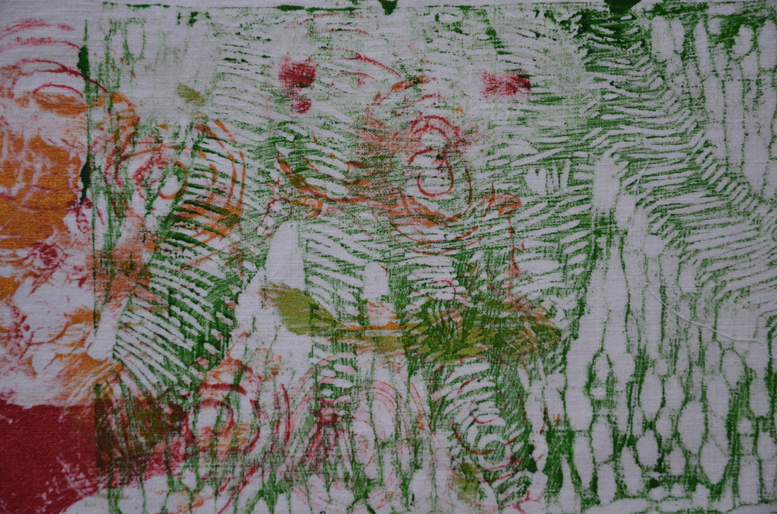 This monoprint would have been great if I hadn't just stamped it anywhere on top of some other splodges and snails. Oh well. I'm sure I'll find some use for it! Nothing goes to waste here.
|
Archives
March 2023
Categories
All
|
 RSS Feed